Breidamerkursandur is the black sand beach near Jokulsarlon glacier lagoon. I'm brave enough to say it's one of the most incredible places to photograph that is furthermore very easily accessible. It is the contrast between the volcanic black sand and crystal-clear to turquoise colors of icebergs that makes it feel otherworldly and extraordinary.
I have been to Jokulsarlon many times. So were you, I bet. Either in person, or through someone else's picture. I wonder if you ever had a really good light over there, but I haven't as yet. Not once from some 20 sessions over 5 trips.
This November morning was no different. Moreover, the beach began to be extremely crowded that I wrote about earlier. I took a long walk alongside the shore. There were plenty of icebergs lying on the sand, notably more than during my earlier visits. I was thinking what else I can shoot other than what I have already done here under such overcast sky.
With Woodkid in my ears (above), with hordes of photographers far behind my back, I enjoyed my noble encounter with the tides and icebergs. The angry ocean kept producing tall, violent and loud waves that were putting icebergs into a constant fierce motion. Cut from reality, I watched the performance. When I forgot about a sense of scale here, it reminded me an apocalyptic sequence of tsunami smashing on a large city.
Suddenly I felt inspired to catch this movement and its dull morning mood; to put an order into what seemed to be a major disorder. The next 90 minutes I spent searching for the right set up, close enough to icebergs but far enough from a potential rush of water. I wanted a longer exposure to capture the motion within the frame. Few times I had to run off or got badly hit by a wave destroying my shot with no mercy.
I ended up with about 30 raw files. Brief sample of them below:
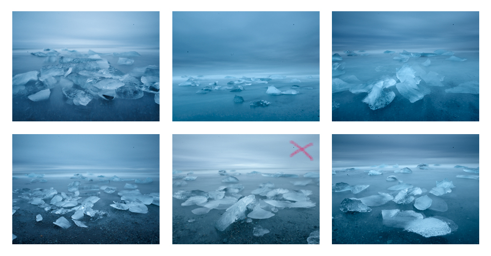
Marked is the one closest to what I tried to represent. I processed it in Capture One with the following adjustments:
- White Balance (-300 K), Tint (-0.9) to get slightly colder rendition;
- Shadow Adjustment (+42) for balancing the foreground with the sky;
- Clarity (+40) and Structure (+25) to bring back more contrast;
- Lens Correction (Hasselblad HC 35mm 3.5) is beautiful feature that automatically corrects distortion visible on the horizon.
You can see these are the subtle changes only - generally balancing shadows and bringing out contrast.
Now, I need to continue in Photoshop to try to reconstruct the depressive melancholy and apocalyptic mood of the scenery that I felt back there. The ice in the bottom right corner had to be cloned out - it must have come there unexpectedly during the exposure. I didn't need to do much to the image in order to end up where I wanted.
The key is the sense of movement of water, of icebergs and in the sky, while keeping few little black rocks in the foreground static. The diagonally directed iceberg in the foreground is the main building block for the composition. It defines the wide V-shape order of seemingly disordered mass of ice. I would want to emphasise the dark atmosphere via cold monochromatic feel of the image.
So below is the final picture, with metadata underneath. Read on if interested how I ended up here.
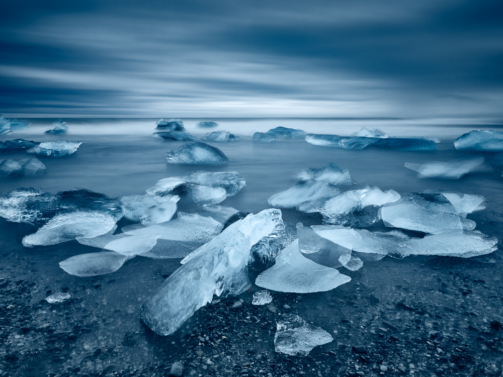
Caption: Rush and Crush, Camera: Hasselblad H1, Lens: Hasselblad HC 35mm 3.5, Digital Back: Phase One IQ150, ISO: 100, Exposure: 1m31s, Aperture: f/25, Filters: Lee Big Stopper, Lee ND Graduated 0.6
I recently received few queries asking to describe my post-process workflow. Hence I'm adding couple of Photoshop screenshots with explanations of each layer applied. As you see, I'm mostly using Google's Nik Color Efex Pro tools because over years, I found them very efficient and useful.
In Photoshop CC, I applied Levels and Pro Contrast (of Nik Color Efex Pro) to bring out contrast and add little bit of dynamics to the processed raw file:
Graduated Neutral Density was used to darken the sky and White Neutraliser to push back blue cast in whites:
Furthermore, I used Vibrance tool to desaturate by approximately 15% (the original was far too blueish) and subsequently Brightness & Contrast tool to seriously add contrast (+42):
And finally, Darken / Lighten Center (of Nik Color Efex Pro) helped to darken the edges so that the emphasise is put more to the centre. Curves and Levels helped me brighten the image gently as I just found it too dark. It is important to note that the most of the layer (see above for example) were applied in Luminosity blending mode so that the colors remain intact and only lightness is impacted. This helps to preserve saturation at unchanged levels that I find extremely important.
As much as it sounds cliched, I really try to capture the very most of the story in a single shot in a camera. Until not long ago I didn't have any other chance as I was using transparency film almost exclusively. This influenced my post-processing workflow heavily - there's not much one needs to do with a properly scanned image except for fine tuning its contrast, brightness and color rendition and eventual shifts.